NYC Islands
Year
2026
Role
Tools
Figma
Webflow
Claude
Project Type
Web Design
Branding
NYC Islands is a Mellon Foundation-funded initiative documenting all 42+ islands of New York City. The project translates a dense academic research database into a low-cognitive-load web experience for general audiences, alongside a physical branding system- a collectible passport and island sticker set.

CONTEXT
New York City is an archipelago. Most people don't know that. With over 42 islands ranging from the iconic to the entirely forgotten, NYC's island geography is one of its least understood dimensions: ecologically, historically, and culturally.
NYC Islands is part of Mellon Foundation-supported initiative, exploring Islands, Archipelagoes, and Cultural Ecologies of New York City. A parallel research team built the database. Our team was responsible for how it reached people- the website, the brand, and the experience.
THE BRIEF
The client came with a clear deliverable: a website. Their initial vision was an interactive map: users would hover over islands, click for details, explore geographically.
Does a user need to know where an island is located before they can care about it?
PROBLEM
NYC has 42+ islands- ecologically, historically, culturally rich. The research database was dense. Our challenge: make it legible for a general audience without overwhelming them.
SOLUTION
01
No geographic prerequisite- users don't need to know where to look
02
Editorial pacing- one island at a time, content breathes

Client Brief
The website was a fixed deliverable. The client's initial vision: an interactive map- users hover over islands, click for details.
Client Meetings
Meetings in the initial and mid phases of the whole timeline shaped direction. Key alignment sessions drove each major pivot.
PROCESS · DISCOVERY
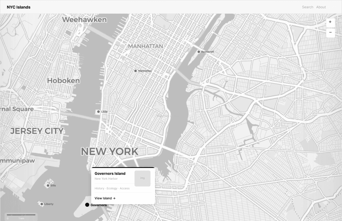
Map Layout
Too generic · assumes geographic knowledge user may not have · technical risk

Grid Layout
Feels like a directory · loses narrative quality · client passed on it

Infinite Scroll ✓
Editorial · no geographic prereq · scalable · distinctive
PROCESS · LAYOUT EXPLORATION
A map front-loads knowledge the user doesn't have yet.
THE INSIGHT
BRANDING
Passport
Started as a treasure hunt- grab from kiosks at airports, Times Square, Liberty Island, etc. Pivoted to a souvenir: a beautifully designed physical artifact, decoupled from the website. Removes friction, removes gatekeeping.

Stickers
NYC Islands sticker system as physical brand touchpoints.

STYLE GUIDE
Color
Ember
#FF4F1A
Parchment
#F8F6F3
Midnight
#1a1208
Ink
#111111
Fog
#BDBDBD
Stone
#707070
White
#FFFFFF
Typography
NYC Islands
Helvetica Neue 700 · Homepage · UI
Governors
Island
Helvetica Neue Condensed · Island hero · 48–72px
America's threshold, where millions first called themselves New Yorkers.
Helvetica Neue SemiBold · Detail tagline
The island played a strategic role during the American Revolution.
Helvetica Neue · Body · lh 1.85
Component: Island Name States
Governors Island
Ellis Island
Liberty Island
Active: Ember · ltr-spacing 0.09em
Hover: rgba(0,0,0,0.42) · Default: rgba(0,0,0,0.15)
Wordmark
NYC
Islands
NYC
Islands
"Islands" always Ember · never swap
FINAL PRODUCT


What I'd do differently: Earlier user testing, even a single informal session - would have validated the scroll layout faster and given us sharper evidence to present to the client instead of relying on design intuition alone.
What's next: A Medium article and Awwwards submission are being considered. A responsive mobile version remains a potential personal extension.
REFLECTION